
State Department Unveils New Vibes-Based Map Of Africa
Officials say redesigned continent reflects “a more flexible, innovation-forward understanding of where things are”
By Atlas B. Lost, Senior Cartographic Affairs Correspondent
RIO DE JANEIRO, BRAZIL — The U.S. State Department unveiled a dramatically redesigned map of Africa this week after determining that the continent’s existing geography was “outdated, overly complicated, and unnecessarily dependent on facts.”
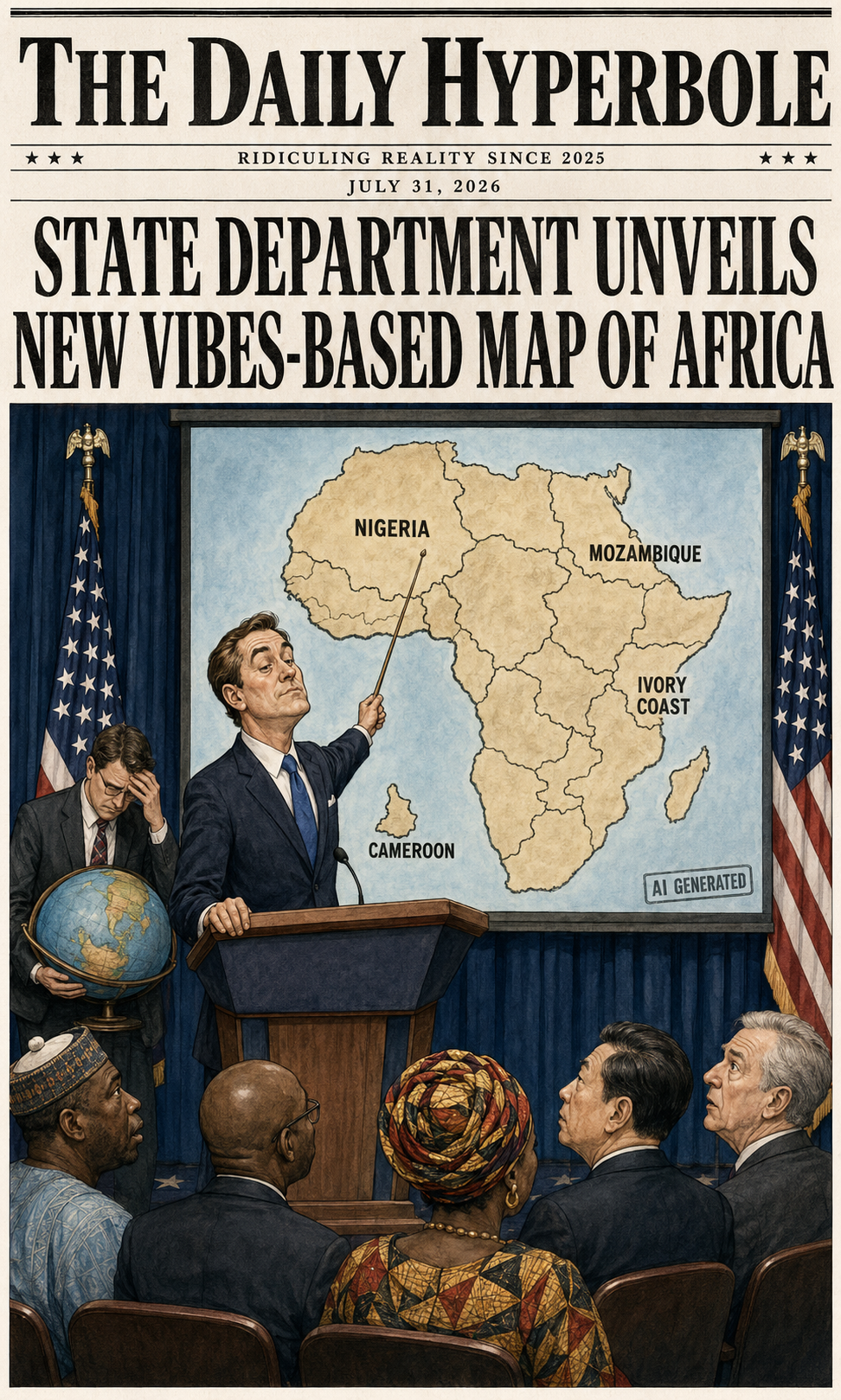
The map, presented during an international health conference in Brazil, reportedly mislabeled every country on the African continent, placing Nigeria in the Sahara, moving Mozambique toward the Horn of Africa, relocating Ivory Coast to the opposite side of the continent, and identifying Cameroon while declining to physically include it.
State Department officials defended the presentation, describing the map as an early prototype of America’s new “vibes-based geography” initiative.
“For too long, cartography has been constrained by rigid concepts like borders, coordinates, coastlines, and knowing where countries are,” said State Department spokesperson Bradley Compass, standing beside the map with his arms folded confidently. “This administration believes geography should be flexible, intuitive, and responsive to the rapidly changing needs of whoever is making the PowerPoint.”
Compass emphasized that no African country had been deliberately misplaced.
“They were moved automatically,” he clarified.
The map immediately drew concern from diplomats, geographers, public-health officials, and several African representatives who were surprised to learn that their countries had apparently migrated hundreds of miles overnight.
A Nigerian delegate reportedly stared at the presentation for several minutes before asking why his country had been moved inland, northward, and directly into a desert.
“That is an excellent question,” Compass responded. “Unfortunately, we do not have anyone from Nigeria here today.”
The delegate then explained that he was from Nigeria.
“Wonderful,” Compass said. “Perhaps you can help us locate it.”
According to officials familiar with the presentation, the map was created shortly before the conference by a staffer who typed “professional map of Africa, accurate, government quality, no mistakes” into an artificial-intelligence image generator.
The resulting graphic contained an AI watermark, several imaginary borders, at least one country shaped like a potato, and a large unlabeled region officials later identified as “probably important.”
Despite these irregularities, the map reportedly passed the State Department’s rigorous three-stage review process:
First, an employee confirmed that Africa appeared somewhere on the slide.
Second, a supervisor checked that the surrounding water was blue.
Third, everyone agreed there was no time to fix it.
“We followed procedure,” said Deputy Assistant Undersecretary for Visual Materials Kent Folder. “The slide had a title, a map, and several colors. From a presentation standpoint, that is complete.”
When asked why nobody compared the graphic with an existing map, Folder said the department had considered doing so but worried that introducing a second map would create “competing geographical narratives.”
“You have one map saying Nigeria is here and another saying Nigeria is over there,” Folder explained. “Suddenly, the room becomes polarized. We wanted to avoid that.”
Officials also rejected accusations that the map was inaccurate, arguing that accuracy is an increasingly subjective standard.
“We prefer the term ‘geographically aspirational,’” Compass said. “Some countries may not currently be located where we placed them, but international relations is about imagining what is possible.”
The department has since established a temporary Office of Dynamic Geography to determine whether the countries should be moved back or whether Africa should simply be reorganized around the new map.
Early proposals would divide the continent into four simplified administrative regions: Upper Africa, Lower Africa, Africa Near The Ocean, and The Part We’re Still Looking Into.
“The existing system has fifty-four countries,” said Folder. “That is far too many for a single slide. Nobody has that kind of screen space.”
Under the proposed modernization plan, smaller nations may be combined into larger “geographical efficiency zones,” while countries whose names are difficult for American officials to pronounce could be assigned numbers.
Several nations would also be relocated closer to Europe to reduce diplomatic travel time.
“This is not colonialism,” Compass stressed. “Colonial powers generally knew which countries they were entering.”
African diplomats were reportedly unconvinced by the explanation.
Representatives from Ghana, Kenya, Senegal, Botswana, Namibia, and Rwanda submitted a joint letter asking the United States to immediately correct the map and explain how every individual country could be labeled incorrectly.
State Department officials responded that achieving a 100 percent error rate across an entire continent demonstrated “remarkable internal consistency.”
“If we had gotten only one or two countries wrong, that would suggest carelessness,” Compass said. “Getting all of them wrong indicates a system.”
The department also noted that many of the names used on the map were technically real African countries, even if they had been placed nowhere near their actual locations.
“We never claimed Nigeria was not a country,” Folder said. “We simply presented an alternative opinion regarding where Nigeria happens.”
When reporters pointed out that national locations are not generally considered matters of opinion, Folder opened his laptop, searched “Is geography subjective?” and spent several minutes reading an AI-generated summary.
“It appears there are multiple perspectives,” he eventually concluded.
Secretary of State officials promised that future presentations would include additional safeguards, such as asking the AI to “double-check everything” and assigning an intern to remove visible watermarks.
The department will also require employees to complete a new online cartography course consisting of a six-minute video titled Africa: Bigger Than You Think.
Employees who complete the training will receive a certificate confirming they can identify the continent from three possible choices.
“This is a learning opportunity,” Compass said. “Nobody expects the United States government to know every country in the world. That would be an unreasonable burden on government.”
The incident has already inspired a broader review of federal maps, with officials reportedly discovering serious irregularities across multiple agencies.
One Department of Agriculture graphic labeled all land west of the Mississippi “California,” while a Homeland Security map depicted Canada as a large gray security threat hovering above the United States.
A Pentagon map of the Middle East consisted solely of several red circles and the words “Something Is Happening Here.”
Officials also found a domestic map that identified twenty-seven separate states as Iowa.
“We are correcting that one,” Folder confirmed. “At least four of them are clearly Nebraska.”
Despite mounting criticism, the State Department insisted the African map would remain available for internal use, particularly in meetings where no African representatives are present.
Officials also announced plans to modernize maps of South America, Southeast Asia, and Europe.
The preliminary European design reportedly consolidates the continent into five easily recognizable regions: Britain, France, Germany, Italy, and Other Soccer Countries.
South America will be represented by Brazil surrounded by “Supporting Nations,” while Australia has been moved closer to the United States because staff members were tired of scrolling.
“We are entering a new era of American cartography,” Compass declared. “An era in which maps reflect not merely where countries are, but where we vaguely remember them being.”
At press time, the State Department released a corrected version of the African map that accurately labeled all fifty-four countries but accidentally placed the entire continent where South America should be.
Officials called the update “significant progress.”